pandasでプロットを作成するにはどうすればよいですか?#

In [1]: import pandas as pd

In [2]: import matplotlib.pyplot as plt
- 大気質データ
In [3]: air_quality = pd.read_csv("data/air_quality_no2.csv", index_col=0, parse_dates=True)

In [4]: air_quality.head()
Out[4]:
                     station_antwerp  station_paris  station_london
datetime
2019-05-07 02:00:00              NaN            NaN            23.0
2019-05-07 03:00:00             50.5           25.0            19.0
2019-05-07 04:00:00             45.0           27.7            19.0
2019-05-07 05:00:00              NaN           50.4            16.0
2019-05-07 06:00:00              NaN           61.9             NaN
注
read_csv関数のindex_colおよびparse_datesパラメータを使用すると、結果のDataFrameのインデックスとして最初の(0番目の)列を定義し、列の日付をTimestampオブジェクトにそれぞれ変換します。
データの視覚的なクイックチェックをしたいです。
In [5]: air_quality.plot()
Out[5]: <Axes: xlabel='datetime'>

In [6]: plt.show()
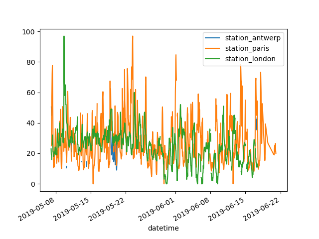
DataFrameでは、pandasはデフォルトで数値データを持つ各列に対して1つの折れ線グラフを作成します。
データテーブルのパリのデータを持つ列のみをプロットしたいです。
In [7]: air_quality["station_paris"].plot()
Out[7]: <Axes: xlabel='datetime'>

In [8]: plt.show()
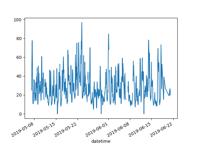
特定の列をプロットするには、サブセットデータチュートリアルの選択メソッドと
plot()メソッドを組み合わせて使用します。したがって、plot()メソッドはSeriesとDataFrameの両方で機能します。
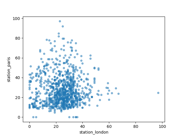
ロンドンとパリで測定された\(NO_2\)値を視覚的に比較したいです。
In [9]: air_quality.plot.scatter(x="station_london", y="station_paris", alpha=0.5)
Out[9]: <Axes: xlabel='station_london', ylabel='station_paris'>

In [10]: plt.show()
plot関数を使用する際のデフォルトのlineプロットとは別に、データをプロットするためのいくつかの選択肢があります。利用可能なプロットメソッドの概要を得るために、標準のPythonを使用してみましょう。
In [11]: [
   ....:     method_name
   ....:     for method_name in dir(air_quality.plot)
   ....:     if not method_name.startswith("_")
   ....: ]
   ....:
Out[11]:
['area',
 'bar',
 'barh',
 'box',
 'density',
 'hexbin',
 'hist',
 'kde',
 'line',
 'pie',
 'scatter']
注
多くの開発環境、IPython、Jupyter Notebookでは、TABボタンを使用して利用可能なメソッドの概要を取得します。例えば、air_quality.plot. + TAB。
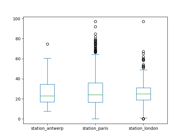
選択肢の1つはDataFrame.plot.box()で、これはボックスプロットを指します。boxメソッドは大気質データ例に適用できます。
In [12]: air_quality.plot.box()
Out[12]: <Axes: >

In [13]: plt.show()
デフォルトの折れ線グラフ以外のプロットの紹介については、サポートされているプロットスタイルに関するユーザーガイドのセクションを参照してください。
各列を個別のサブプロットにしたいです。
In [14]: axs = air_quality.plot.area(figsize=(12, 4), subplots=True)

In [15]: plt.show()
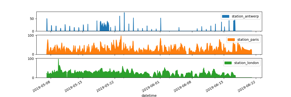
データ列ごとの個別のサブプロットは、
plot関数のsubplots引数でサポートされています。各pandasプロット関数で利用できる組み込みオプションは検討する価値があります。
さらに多くの書式設定オプションは、プロットの書式設定に関するユーザーガイドのセクションで説明されています。
結果のプロットをさらにカスタマイズ、拡張、または保存したいです。
In [16]: fig, axs = plt.subplots(figsize=(12, 4))

In [17]: air_quality.plot.area(ax=axs)
Out[17]: <Axes: xlabel='datetime'>

In [18]: axs.set_ylabel("NO$_2$ concentration")
Out[18]: Text(0, 0.5, 'NO$_2$ concentration')

In [19]: fig.savefig("no2_concentrations.png")

In [20]: plt.show()
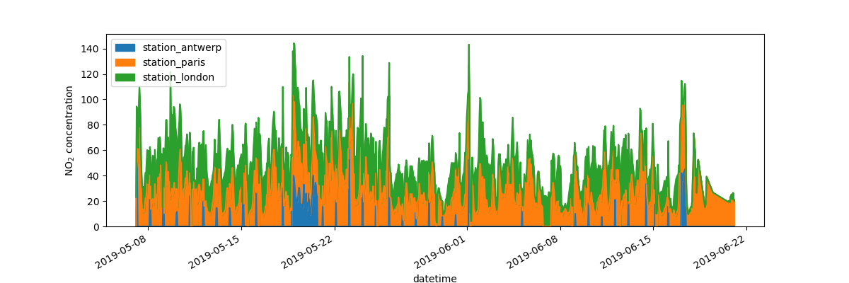
pandasによって作成される各プロットオブジェクトは、Matplotlibオブジェクトです。Matplotlibはプロットをカスタマイズするための多くのオプションを提供するため、pandasとMatplotlib間のリンクを明示的にすることで、Matplotlibのすべての機能をプロットに活用できます。この戦略は以前の例で適用されています。
fig, axs = plt.subplots(figsize=(12, 4))        # Create an empty Matplotlib Figure and Axes
air_quality.plot.area(ax=axs)                   # Use pandas to put the area plot on the prepared Figure/Axes
axs.set_ylabel("NO$_2$ concentration")          # Do any Matplotlib customization you like
fig.savefig("no2_concentrations.png")           # Save the Figure/Axes using the existing Matplotlib method.
plt.show()                                      # Display the plot
覚えておいてください
.plot.*メソッドはSeriesとDataFramesの両方に適用できます。デフォルトでは、各列は異なる要素(線、箱ひげ図など)としてプロットされます。
pandasによって作成されるすべてのプロットはMatplotlibオブジェクトです。
pandasでのプロットの完全な概要は、視覚化ページで提供されています。