グラフの視覚化#
注
以下の例は、Jupyter を使用していることを前提としています。
このセクションでは、グラフによる視覚化について説明します。表形式データの視覚化については、「表の視覚化」セクションを参照してください。
matplotlib API を参照するための標準的な規則を使用します。
In [1]: import matplotlib.pyplot as plt

In [2]: plt.close("all")
pandas では、見栄えの良いプロットを簡単に作成するための基本機能を提供しています。ここで説明されている基本的な機能を超える視覚化ライブラリについては、エコシステムページを参照してください。
注
np.random へのすべての呼び出しは、123456 でシードされています。
基本的なプロット: plot#
ここでは基本を説明します。より高度な戦略については、クックブックを参照してください。
Series および DataFrame の plot メソッドは、plt.plot() のシンプルなラッパーです。
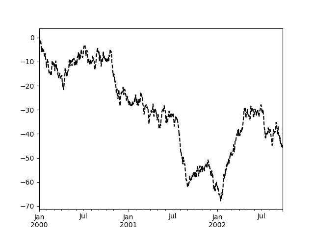
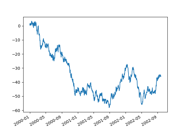
In [3]: np.random.seed(123456)

In [4]: ts = pd.Series(np.random.randn(1000), index=pd.date_range("1/1/2000", periods=1000))

In [5]: ts = ts.cumsum()

In [6]: ts.plot();
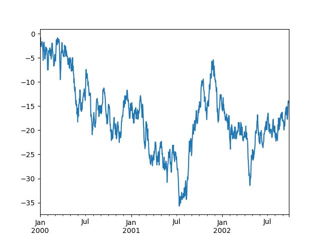
インデックスが日付で構成されている場合、上記のように x 軸をきれいにフォーマットするために gcf().autofmt_xdate() が呼び出されます。
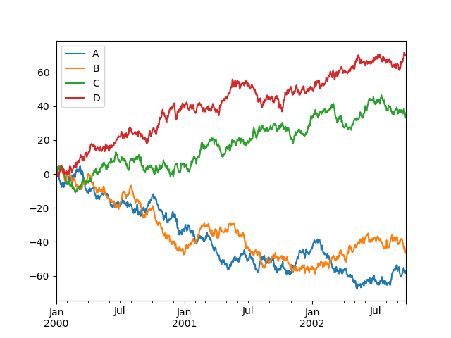
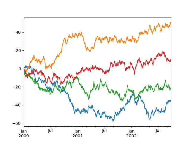
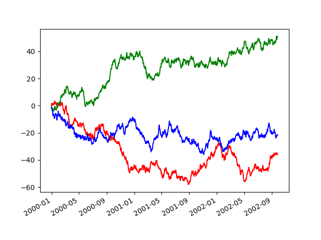
DataFrame では、plot() は、すべての列をラベル付きでプロットするための便利なメソッドです。
In [7]: df = pd.DataFrame(np.random.randn(1000, 4), index=ts.index, columns=list("ABCD"))

In [8]: df = df.cumsum()

In [9]: plt.figure();

In [10]: df.plot();
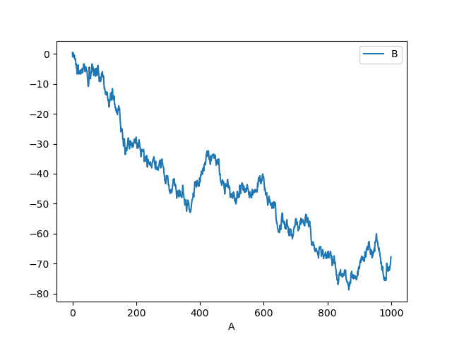
plot() の x および y キーワードを使用して、ある列と別の列をプロットできます。
In [11]: df3 = pd.DataFrame(np.random.randn(1000, 2), columns=["B", "C"]).cumsum()

In [12]: df3["A"] = pd.Series(list(range(len(df))))

In [13]: df3.plot(x="A", y="B");
注
その他の書式設定とスタイルオプションについては、以下の書式設定を参照してください。
その他のプロット#
プロットメソッドは、デフォルトの線プロット以外のいくつかのプロットスタイルを許可します。これらのメソッドは、plot() の kind キーワード引数として提供でき、以下が含まれます。
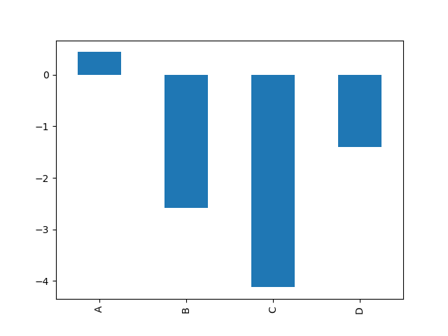
たとえば、棒グラフは次のように作成できます。
In [14]: plt.figure();

In [15]: df.iloc[5].plot(kind="bar");
kind キーワード引数を提供する代わりに、DataFrame.plot.<kind> メソッドを使用してこれらの他のプロットを作成することもできます。これにより、プロットメソッドとそれらが使用する特定の引数を簡単に見つけることができます。
In [16]: df = pd.DataFrame()

In [17]: df.plot.<TAB>  # noqa: E225, E999
df.plot.area     df.plot.barh     df.plot.density  df.plot.hist     df.plot.line     df.plot.scatter
df.plot.bar      df.plot.box      df.plot.hexbin   df.plot.kde      df.plot.pie
これらの kind に加えて、別のインターフェースを使用する DataFrame.hist() および DataFrame.boxplot() メソッドがあります。
最後に、pandas.plotting には、Series または DataFrame を引数として受け取るいくつかのプロット関数があります。これらには以下が含まれます。
プロットには、エラーバーまたはテーブルを装飾することもできます。
棒グラフ#
ラベル付きの非時系列データの場合、棒グラフを作成したい場合があります。
In [18]: plt.figure();

In [19]: df.iloc[5].plot.bar();

In [20]: plt.axhline(0, color="k");
DataFrame の plot.bar() メソッドを呼び出すと、複数の棒グラフが生成されます。
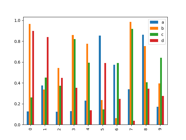
In [21]: df2 = pd.DataFrame(np.random.rand(10, 4), columns=["a", "b", "c", "d"])

In [22]: df2.plot.bar();
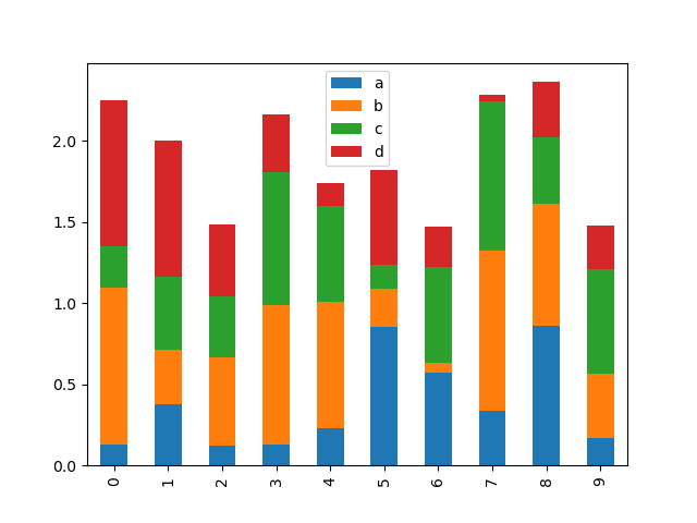
積み上げ棒グラフを作成するには、stacked=True を渡します。
In [23]: df2.plot.bar(stacked=True);
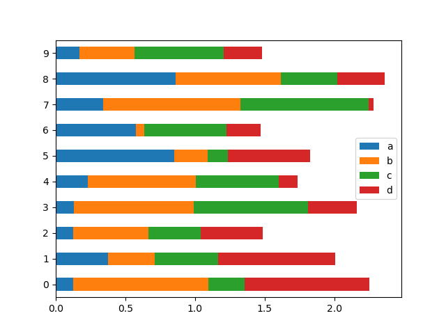
横棒グラフを作成するには、barh メソッドを使用します。
In [24]: df2.plot.barh(stacked=True);
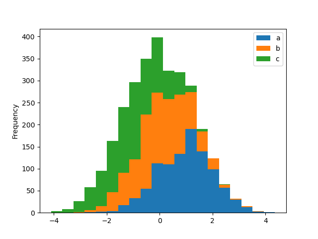
ヒストグラム#
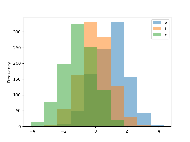
DataFrame.plot.hist() および Series.plot.hist() メソッドを使用して、ヒストグラムを描画できます。
In [25]: df4 = pd.DataFrame(
   ....:     {
   ....:         "a": np.random.randn(1000) + 1,
   ....:         "b": np.random.randn(1000),
   ....:         "c": np.random.randn(1000) - 1,
   ....:     },
   ....:     columns=["a", "b", "c"],
   ....: )
   ....:

In [26]: plt.figure();

In [27]: df4.plot.hist(alpha=0.5);
stacked=True を使用してヒストグラムを積み重ねることができます。bins キーワードを使用してビンサイズを変更できます。
In [28]: plt.figure();

In [29]: df4.plot.hist(stacked=True, bins=20);
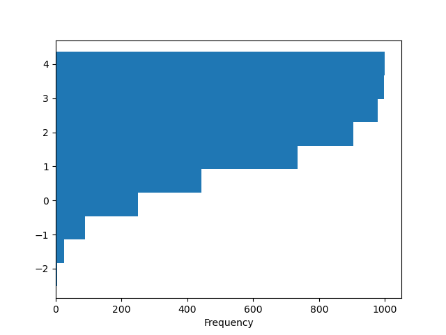
matplotlib の hist がサポートする他のキーワードを渡すことができます。たとえば、orientation='horizontal' と cumulative=True を使用して、水平および累積ヒストグラムを描画できます。
In [30]: plt.figure();

In [31]: df4["a"].plot.hist(orientation="horizontal", cumulative=True);
詳細については、hist メソッドおよびmatplotlib hist ドキュメントを参照してください。
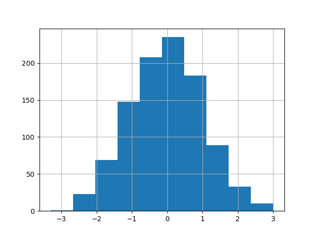
ヒストグラムをプロットするための既存のインターフェース DataFrame.hist は引き続き使用できます。
In [32]: plt.figure();

In [33]: df["A"].diff().hist();
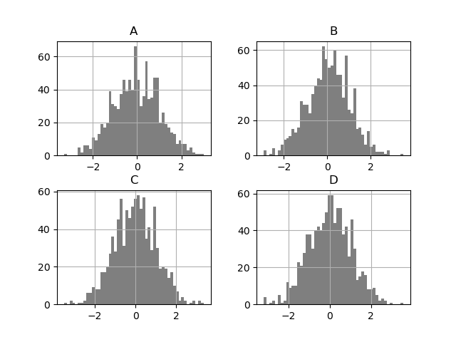
DataFrame.hist() は、複数のサブプロットに列のヒストグラムをプロットします。
In [34]: plt.figure();

In [35]: df.diff().hist(color="k", alpha=0.5, bins=50);
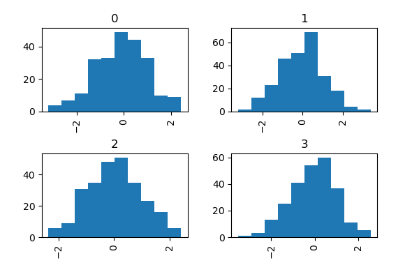
グループ化されたヒストグラムをプロットするために、by キーワードを指定できます。
In [36]: data = pd.Series(np.random.randn(1000))

In [37]: data.hist(by=np.random.randint(0, 4, 1000), figsize=(6, 4));
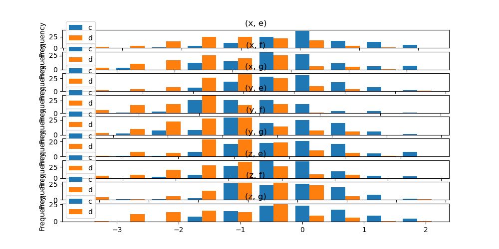
さらに、DataFrame.plot.hist() でも by キーワードを指定できます。
バージョン 1.4.0 で変更。
In [38]: data = pd.DataFrame(
   ....:     {
   ....:         "a": np.random.choice(["x", "y", "z"], 1000),
   ....:         "b": np.random.choice(["e", "f", "g"], 1000),
   ....:         "c": np.random.randn(1000),
   ....:         "d": np.random.randn(1000) - 1,
   ....:     },
   ....: )
   ....:

In [39]: data.plot.hist(by=["a", "b"], figsize=(10, 5));
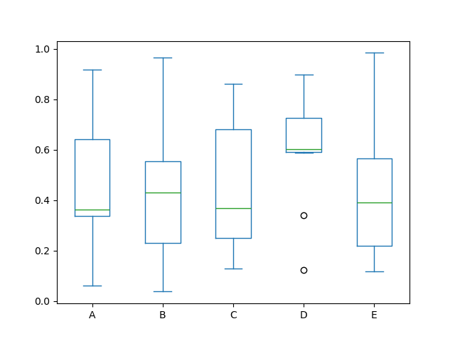
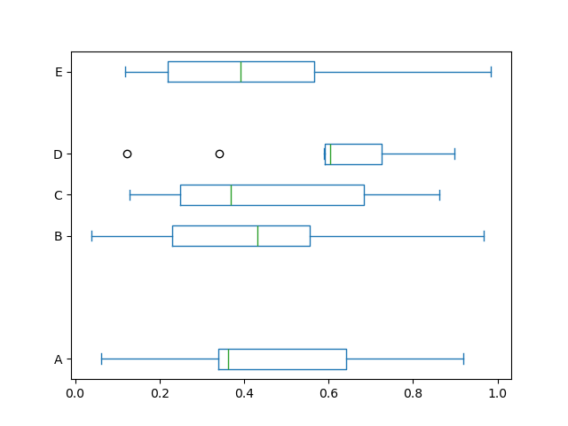
箱ひげ図#
各列内の値の分布を視覚化するために、Series.plot.box() および DataFrame.plot.box()、または DataFrame.boxplot() を呼び出して箱ひげ図を描画できます。
たとえば、以下は [0,1) 上の一様乱数変数の 10 個の観測値の 5 回の試行を表す箱ひげ図です。
In [40]: df = pd.DataFrame(np.random.rand(10, 5), columns=["A", "B", "C", "D", "E"])

In [41]: df.plot.box();
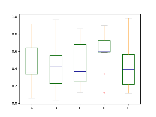
color キーワードを渡すことで、箱ひげ図に色を付けることができます。キーが boxes、whiskers、medians、caps である dict を渡すことができます。dict に一部のキーがない場合、対応するアーティストにはデフォルトの色が使用されます。また、箱ひげ図には、フリャースタイルを指定するための sym キーワードがあります。
color キーワードを介して他の種類の引数を渡すと、それはすべての boxes、whiskers、medians、caps の色付けのために matplotlib に直接渡されます。
色が描画されるすべてのボックスに適用されます。より複雑な色付けが必要な場合は、return_type を渡すことで、描画された各アーティストを取得できます。
In [42]: color = {
   ....:     "boxes": "DarkGreen",
   ....:     "whiskers": "DarkOrange",
   ....:     "medians": "DarkBlue",
   ....:     "caps": "Gray",
   ....: }
   ....:

In [43]: df.plot.box(color=color, sym="r+");
また、matplotlib の boxplot がサポートする他のキーワードを渡すこともできます。たとえば、vert=False および positions キーワードを使用して、水平およびカスタム位置の箱ひげ図を描画できます。
In [44]: df.plot.box(vert=False, positions=[1, 4, 5, 6, 8]);
詳細については、boxplot メソッドおよびmatplotlib boxplot ドキュメントを参照してください。
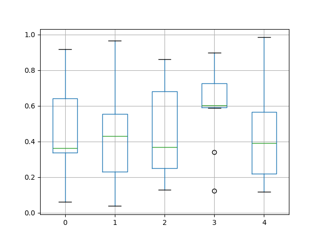
箱ひげ図をプロットするための既存のインターフェース DataFrame.boxplot は引き続き使用できます。
In [45]: df = pd.DataFrame(np.random.rand(10, 5))

In [46]: plt.figure();

In [47]: bp = df.boxplot()
by キーワード引数を使用してグループ化を作成することで、層別箱ひげ図を作成できます。たとえば、
In [48]: df = pd.DataFrame(np.random.rand(10, 2), columns=["Col1", "Col2"])

In [49]: df["X"] = pd.Series(["A", "A", "A", "A", "A", "B", "B", "B", "B", "B"])

In [50]: plt.figure();

In [51]: bp = df.boxplot(by="X")
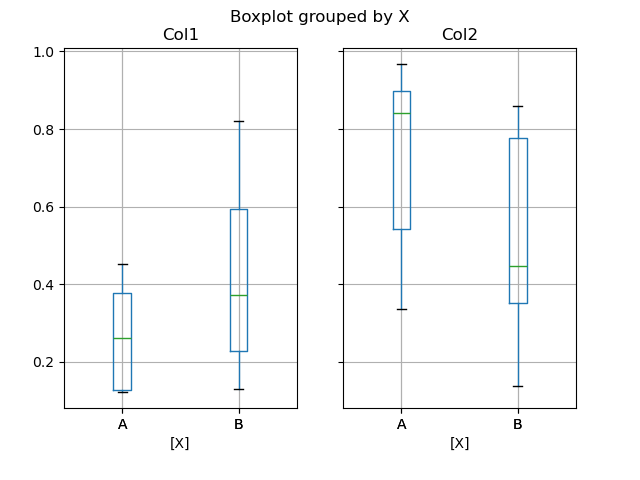
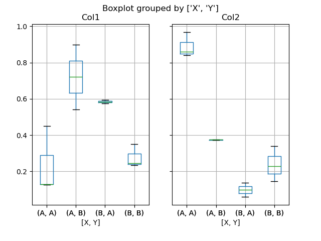
プロットする列のサブセットを渡したり、複数の列でグループ化したりすることもできます。
In [52]: df = pd.DataFrame(np.random.rand(10, 3), columns=["Col1", "Col2", "Col3"])

In [53]: df["X"] = pd.Series(["A", "A", "A", "A", "A", "B", "B", "B", "B", "B"])

In [54]: df["Y"] = pd.Series(["A", "B", "A", "B", "A", "B", "A", "B", "A", "B"])

In [55]: plt.figure();

In [56]: bp = df.boxplot(column=["Col1", "Col2"], by=["X", "Y"])
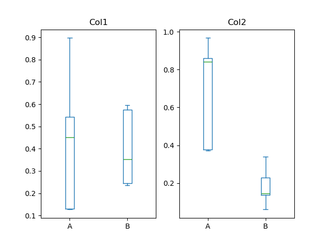
また、DataFrame.plot.box() を使用してグループ化を作成することもできます。たとえば、
バージョン 1.4.0 で変更。
In [57]: df = pd.DataFrame(np.random.rand(10, 3), columns=["Col1", "Col2", "Col3"])

In [58]: df["X"] = pd.Series(["A", "A", "A", "A", "A", "B", "B", "B", "B", "B"])

In [59]: plt.figure();

In [60]: bp = df.plot.box(column=["Col1", "Col2"], by="X")
boxplot では、戻り値の型は return_type キーワードで制御できます。有効な選択肢は {"axes", "dict", "both", None} です。DataFrame.boxplot と by キーワードで作成されたファセット化も出力タイプに影響します。
|
ファセット化 |
出力タイプ |
|---|---|---|
|
いいえ |
軸 |
|
はい |
軸の2次元ndarray |
|
いいえ |
軸 |
|
はい |
軸のシリーズ |
|
いいえ |
アーティストの辞書 |
|
はい |
アーティストの辞書のシリーズ |
|
いいえ |
名前付きタプル |
|
はい |
名前付きタプルのシリーズ |
Groupby.boxplot は常に return_type の Series を返します。
In [61]: np.random.seed(1234)

In [62]: df_box = pd.DataFrame(np.random.randn(50, 2))

In [63]: df_box["g"] = np.random.choice(["A", "B"], size=50)

In [64]: df_box.loc[df_box["g"] == "B", 1] += 3

In [65]: bp = df_box.boxplot(by="g")
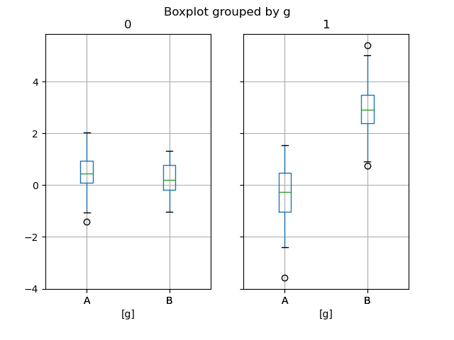
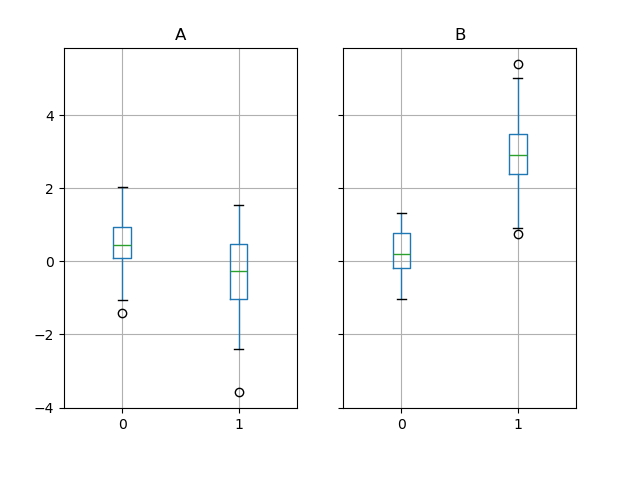
上記のサブプロットは、まず数値列で分割され、次に g 列の値で分割されます。以下では、サブプロットはまず g の値で分割され、次に数値列で分割されます。
In [66]: bp = df_box.groupby("g").boxplot()
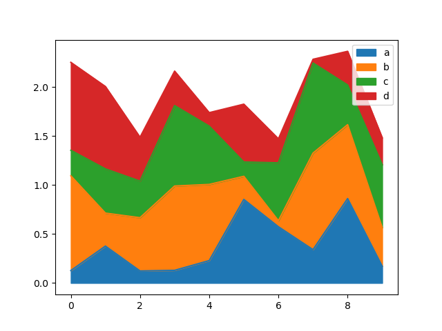
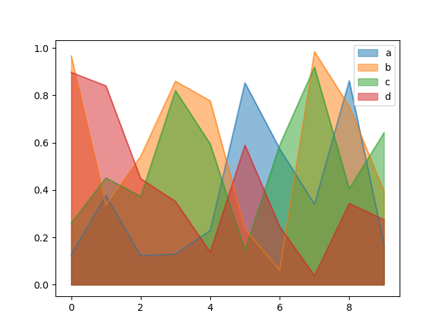
面グラフ#
Series.plot.area() および DataFrame.plot.area() で面グラフを作成できます。面グラフはデフォルトで積み重ねられます。積み重ね面グラフを作成するには、各列はすべて正の値またはすべて負の値である必要があります。
入力データに NaN が含まれている場合、自動的に 0 で埋められます。異なる値でドロップまたは埋めたい場合は、plot を呼び出す前に dataframe.dropna() または dataframe.fillna() を使用してください。
In [67]: df = pd.DataFrame(np.random.rand(10, 4), columns=["a", "b", "c", "d"])

In [68]: df.plot.area();
積み重ねていないプロットを生成するには、stacked=False を渡します。特に指定がない限り、アルファ値は 0.5 に設定されます。
In [69]: df.plot.area(stacked=False);
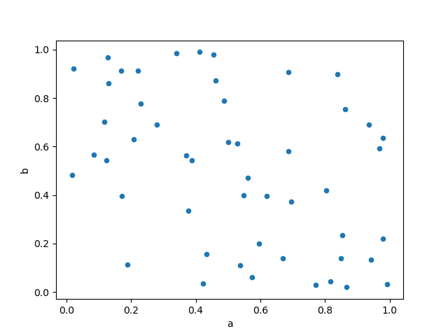
散布図#
DataFrame.plot.scatter() メソッドを使用して散布図を描画できます。散布図には、x 軸と y 軸に数値列が必要です。これらは x および y キーワードで指定できます。
In [70]: df = pd.DataFrame(np.random.rand(50, 4), columns=["a", "b", "c", "d"])

In [71]: df["species"] = pd.Categorical(
   ....:     ["setosa"] * 20 + ["versicolor"] * 20 + ["virginica"] * 10
   ....: )
   ....:

In [72]: df.plot.scatter(x="a", y="b");
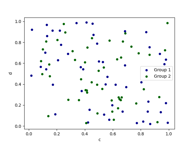
単一の軸に複数の列グループをプロットするには、ターゲットの ax を指定して plot メソッドを繰り返します。各グループを区別するために、color および label キーワードを指定することをお勧めします。
In [73]: ax = df.plot.scatter(x="a", y="b", color="DarkBlue", label="Group 1")

In [74]: df.plot.scatter(x="c", y="d", color="DarkGreen", label="Group 2", ax=ax);
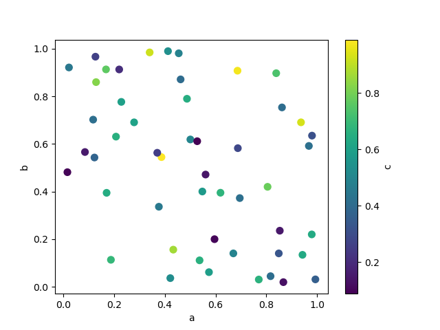
c キーワードは、各点の色の提供に列の名前として指定できます。
In [75]: df.plot.scatter(x="a", y="b", c="c", s=50);
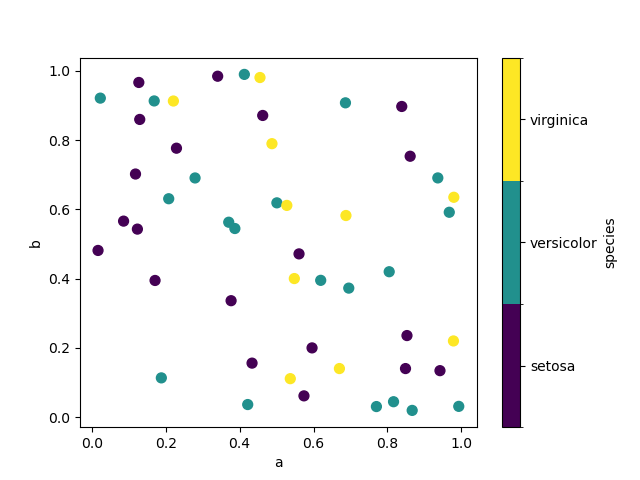
カテゴリカル列が c に渡されると、離散カラーバーが生成されます。
バージョン 1.3.0 で追加。
In [76]: df.plot.scatter(x="a", y="b", c="species", cmap="viridis", s=50);
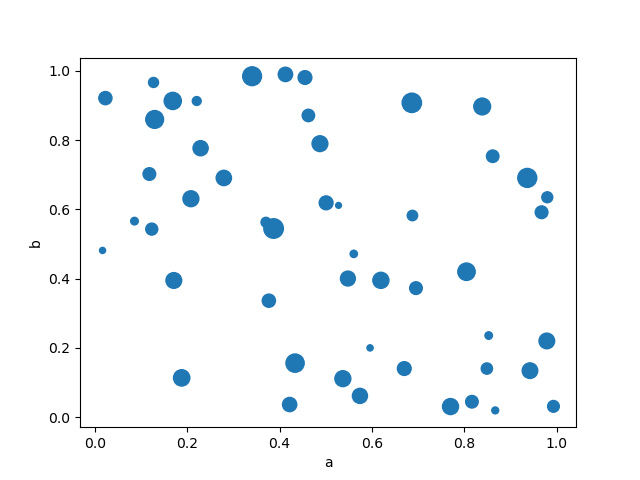
matplotlib scatter でサポートされている他のキーワードを渡すことができます。以下の例は、DataFrame の列をバブルサイズとして使用するバブルチャートを示しています。
In [77]: df.plot.scatter(x="a", y="b", s=df["c"] * 200);
詳細については、scatter メソッドおよびmatplotlib scatter ドキュメントを参照してください。
六角形ビンプロット#
DataFrame.plot.hexbin() を使用して六角形ビンプロットを作成できます。ヘックスビンプロットは、データが密集しすぎて各点を個別にプロットできない場合に、散布図の便利な代替手段となります。
In [78]: df = pd.DataFrame(np.random.randn(1000, 2), columns=["a", "b"])

In [79]: df["b"] = df["b"] + np.arange(1000)

In [80]: df.plot.hexbin(x="a", y="b", gridsize=25);
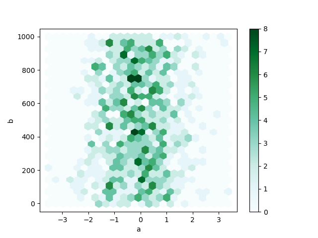
便利なキーワード引数は gridsize です。x 方向の六角形の数を制御し、デフォルトは 100 です。gridsize が大きいほど、ビンが多くなり、小さくなります。
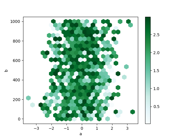
デフォルトでは、各 (x, y) 点の周りのカウントのヒストグラムが計算されます。C および reduce_C_function 引数に値を渡すことで、代替の集計を指定できます。C は各 (x, y) 点での値を指定し、reduce_C_function は、ビン内のすべての値を単一の数値に減らす1つの引数を持つ関数です (例: mean、max、sum、std)。この例では、位置は列 a と b で与えられ、値は列 z で与えられます。ビンは NumPy の max 関数で集計されます。
In [81]: df = pd.DataFrame(np.random.randn(1000, 2), columns=["a", "b"])

In [82]: df["b"] = df["b"] + np.arange(1000)

In [83]: df["z"] = np.random.uniform(0, 3, 1000)

In [84]: df.plot.hexbin(x="a", y="b", C="z", reduce_C_function=np.max, gridsize=25);
詳細については、hexbin メソッドおよびmatplotlib hexbin ドキュメントを参照してください。
円グラフ#
DataFrame.plot.pie() または Series.plot.pie() で円グラフを作成できます。データに NaN が含まれている場合、自動的に 0 で埋められます。データに負の値がある場合は ValueError が発生します。
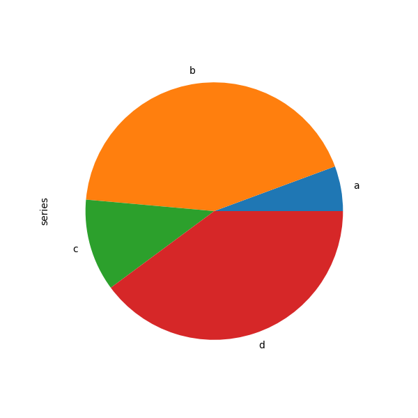
In [85]: series = pd.Series(3 * np.random.rand(4), index=["a", "b", "c", "d"], name="series")

In [86]: series.plot.pie(figsize=(6, 6));
円グラフには正方形の図、つまりアスペクト比 1 の図を使用するのが最適です。同じ幅と高さで図を作成するか、返された axes オブジェクトで ax.set_aspect('equal') を呼び出して、プロット後にアスペクト比を等しく強制することができます。
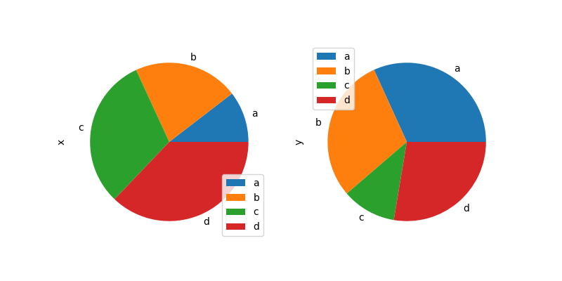
DataFrame を使用した円グラフでは、y 引数でターゲット列を指定するか、subplots=True を指定する必要があることに注意してください。y が指定された場合、選択された列の円グラフが描画されます。subplots=True が指定された場合、各列の円グラフがサブプロットとして描画されます。凡例は各円グラフにデフォルトで描画されます。legend=False を指定して非表示にします。
In [87]: df = pd.DataFrame(
   ....:     3 * np.random.rand(4, 2), index=["a", "b", "c", "d"], columns=["x", "y"]
   ....: )
   ....:

In [88]: df.plot.pie(subplots=True, figsize=(8, 4));
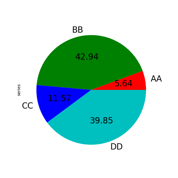
labels および colors キーワードを使用して、各ウェッジのラベルと色を指定できます。
警告
ほとんどの pandas プロットでは label と color 引数を使用します(「s」がないことに注意)。matplotlib.pyplot.pie() との一貫性を保つには、labels と colors を使用する必要があります。
ウェッジラベルを非表示にしたい場合は、labels=None を指定します。fontsize が指定されている場合、その値はウェッジラベルに適用されます。また、matplotlib.pyplot.pie() がサポートする他のキーワードも使用できます。
In [89]: series.plot.pie(
   ....:     labels=["AA", "BB", "CC", "DD"],
   ....:     colors=["r", "g", "b", "c"],
   ....:     autopct="%.2f",
   ....:     fontsize=20,
   ....:     figsize=(6, 6),
   ....: );
   ....:
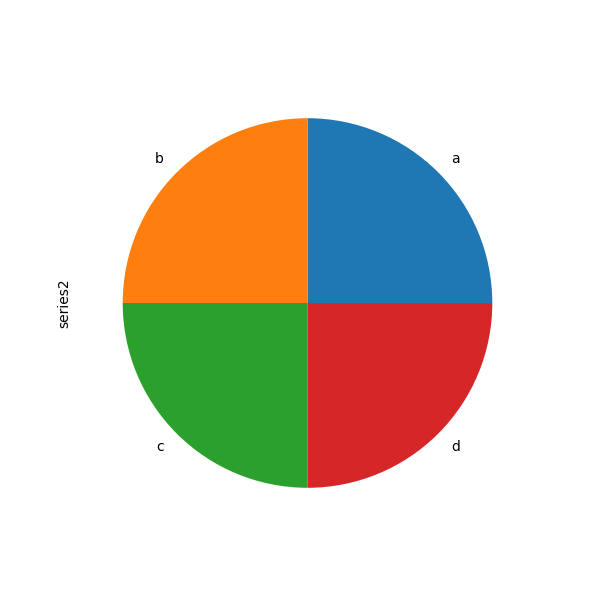
合計が 1.0 未満の値を渡すと、合計が 1 になるように再スケーリングされます。
In [90]: series = pd.Series([0.1] * 4, index=["a", "b", "c", "d"], name="series2")

In [91]: series.plot.pie(figsize=(6, 6));
詳細については、matplotlib pie ドキュメントを参照してください。
欠損データを含むプロット#
pandas は、欠損データを含む DataFrames または Series をプロットする際に実用的に対処しようとします。欠損値は、プロットの種類に応じて、ドロップされたり、除外されたり、埋められたりします。
プロットの種類 |
NaN の処理 |
|---|---|
線 |
NaN の箇所に空白を残す |
線 (積み重ね) |
0 を埋める |
棒 |
0 を埋める |
散布 |
NaN を削除 |
ヒストグラム |
NaN を削除 (列ごと) |
箱 |
NaN を削除 (列ごと) |
面 |
0 を埋める |
KDE |
NaN を削除 (列ごと) |
Hexbin |
NaN を削除 |
円 |
0 を埋める |
これらのデフォルトが意図したものでない場合、または欠損値の処理方法を明示したい場合は、プロットする前に fillna() または dropna() を使用することを検討してください。
プロットツール#
これらの関数は pandas.plotting からインポートでき、Series または DataFrame を引数として受け取ります。
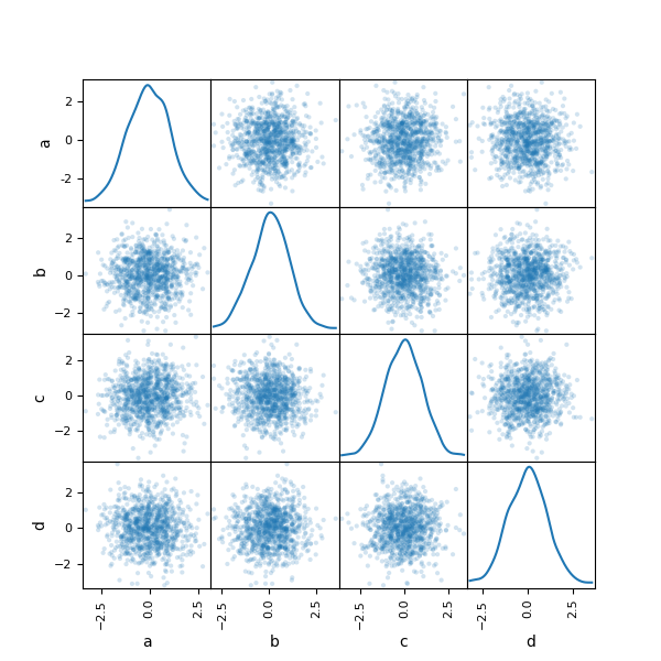
散布図行列プロット#
pandas.plotting の scatter_matrix メソッドを使用して、散布図行列を作成できます。
In [92]: from pandas.plotting import scatter_matrix

In [93]: df = pd.DataFrame(np.random.randn(1000, 4), columns=["a", "b", "c", "d"])

In [94]: scatter_matrix(df, alpha=0.2, figsize=(6, 6), diagonal="kde");
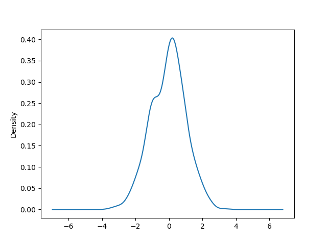
密度プロット#
Series.plot.kde() および DataFrame.plot.kde() メソッドを使用して、密度プロットを作成できます。
In [95]: ser = pd.Series(np.random.randn(1000))

In [96]: ser.plot.kde();
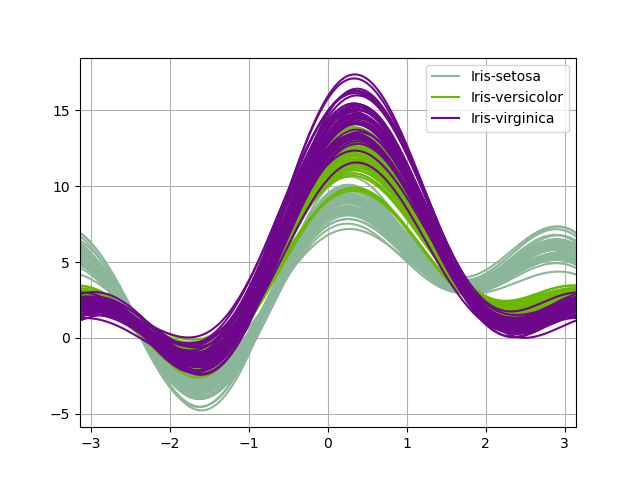
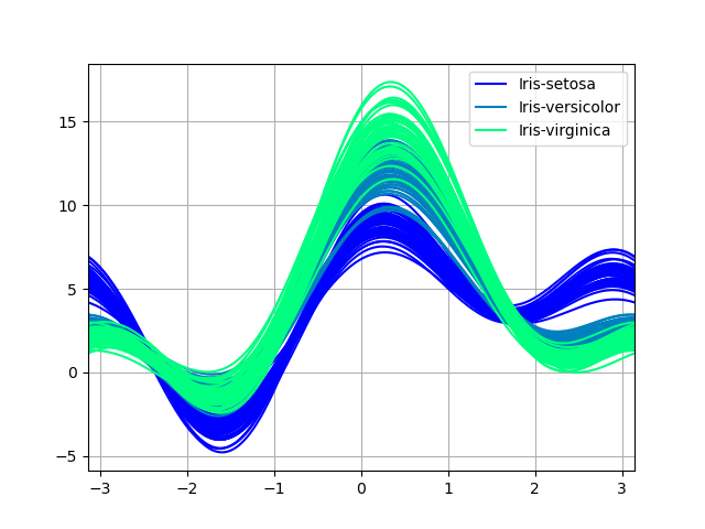
アンドリューズ曲線#
アンドリューズ曲線は、多変量データを、標本の属性をフーリエ級数の係数として使用して作成された多数の曲線としてプロットすることを可能にします。詳細については、Wikipedia の記事を参照してください。これらの曲線を各クラスで異なる色にすることで、データクラスタリングを視覚化できます。同じクラスの標本に属する曲線は、通常、互いに近くに配置され、より大きな構造を形成します。
注: 「Iris」データセットはこちらで入手できます。
In [97]: from pandas.plotting import andrews_curves

In [98]: data = pd.read_csv("data/iris.data")

In [99]: plt.figure();

In [100]: andrews_curves(data, "Name");
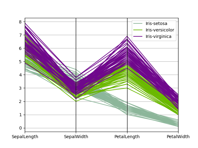
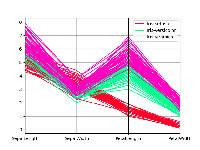
平行座標プロット#
平行座標プロットは、多変量データをプロットするための手法です。詳細は、Wikipedia の記事をご覧ください。平行座標プロットを使用すると、データ内のクラスターを確認し、他の統計量を視覚的に推定できます。平行座標プロットでは、点は接続された線分として表現されます。各垂直線は1つの属性を表します。接続された線分の1つのセットは1つのデータポイントを表します。クラスターを形成する傾向のある点は、互いに近くに表示されます。
In [101]: from pandas.plotting import parallel_coordinates

In [102]: data = pd.read_csv("data/iris.data")

In [103]: plt.figure();

In [104]: parallel_coordinates(data, "Name");
ラグプロット#
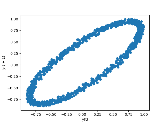
ラグプロットは、データセットまたは時系列がランダムであるかどうかを確認するために使用されます。ランダムなデータは、ラグプロットに構造を示すべきではありません。非ランダムな構造は、基礎となるデータがランダムではないことを意味します。lag 引数を渡すことができ、lag=1 の場合、プロットは実質的に data[:-1] 対 data[1:] です。
In [105]: from pandas.plotting import lag_plot

In [106]: plt.figure();

In [107]: spacing = np.linspace(-99 * np.pi, 99 * np.pi, num=1000)

In [108]: data = pd.Series(0.1 * np.random.rand(1000) + 0.9 * np.sin(spacing))

In [109]: lag_plot(data);
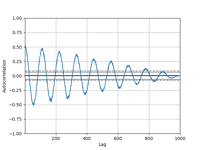
自己相関プロット#
自己相関プロットは、時系列のランダム性をチェックするためによく使用されます。これは、さまざまな時間ラグでのデータ値の自己相関を計算することによって行われます。時系列がランダムである場合、このような自己相関は、任意の時間ラグ分離でゼロに近いはずです。時系列が非ランダムである場合、1つ以上の自己相関が著しく非ゼロになります。プロットに表示される水平線は、95%および99%の信頼帯に対応しています。破線は99%の信頼帯です。自己相関プロットの詳細については、Wikipedia の記事を参照してください。
In [110]: from pandas.plotting import autocorrelation_plot

In [111]: plt.figure();

In [112]: spacing = np.linspace(-9 * np.pi, 9 * np.pi, num=1000)

In [113]: data = pd.Series(0.7 * np.random.rand(1000) + 0.3 * np.sin(spacing))

In [114]: autocorrelation_plot(data);
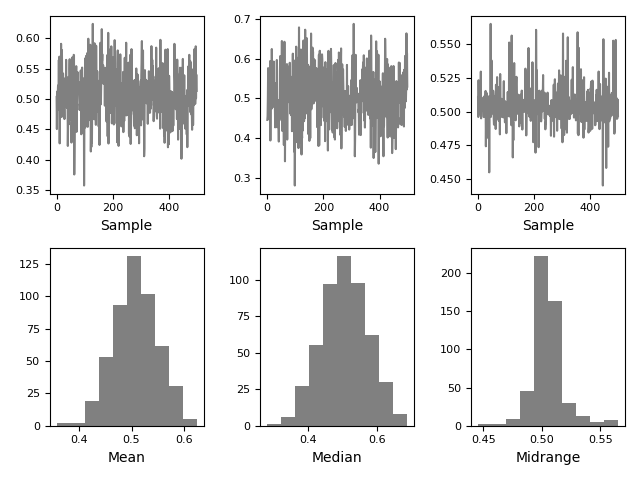
ブートストラッププロット#
ブートストラッププロットは、平均、中央値、ミッドレンジなどの統計量の不確実性を視覚的に評価するために使用されます。指定されたサイズのデータのランダムなサブセットがデータセットから選択され、問題の統計量がこのサブセットに対して計算され、このプロセスが指定された回数繰り返されます。結果として得られるプロットとヒストグラムがブートストラッププロットを構成します。
In [115]: from pandas.plotting import bootstrap_plot

In [116]: data = pd.Series(np.random.rand(1000))

In [117]: bootstrap_plot(data, size=50, samples=500, color="grey");
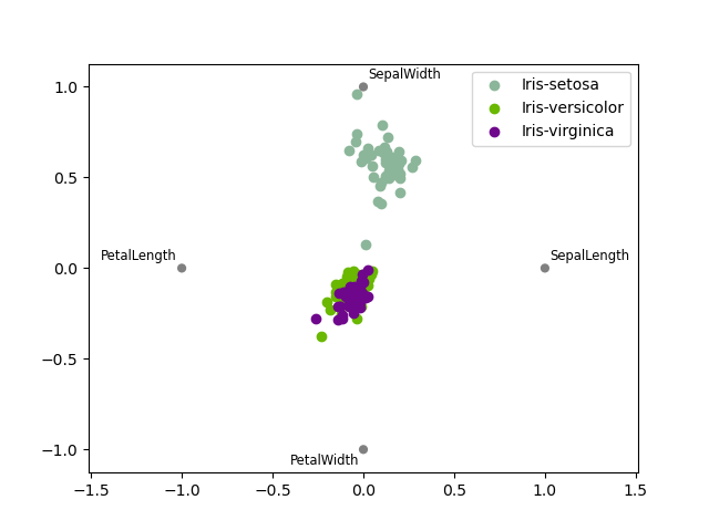
RadViz#
RadVizは、多変量データを視覚化する方法です。単純なバネの張力最小化アルゴリズムに基づいています。基本的には、平面上に多数の点を配置します。この場合、それらは単位円上に等間隔に配置されます。各点は単一の属性を表します。次に、データセット内の各サンプルが、これらの各点にバネで取り付けられていると仮定します。バネの剛性は、その属性の数値に比例します(単位区間に正規化されます)。平面上の点のうち、サンプルが落ち着く場所(サンプルにかかる力が平衡状態にある場所)が、サンプルを表す点が描画される場所になります。そのサンプルが属するクラスに応じて、異なる色で着色されます。詳細については、RパッケージRadvizを参照してください。
注: 「Iris」データセットはこちらで入手できます。
In [118]: from pandas.plotting import radviz

In [119]: data = pd.read_csv("data/iris.data")

In [120]: plt.figure();

In [121]: radviz(data, "Name");
プロットの書式設定#
プロットスタイルの設定#
バージョン1.5以降、matplotlibは事前設定されたプロットスタイルを多数提供しています。スタイルを設定することで、プロットに希望する全体的な外観を簡単に与えることができます。スタイルを設定するには、プロットを作成する前にmatplotlib.style.use(my_plot_style)を呼び出すだけです。たとえば、ggplotスタイルのプロットを作成するにはmatplotlib.style.use('ggplot')と記述できます。
matplotlib.style.available で利用可能な様々なスタイル名を確認でき、それらを試すのは非常に簡単です。
一般的なプロットスタイル引数#
ほとんどのプロットメソッドには、返されるプロットのレイアウトと書式設定を制御する一連のキーワード引数があります。
In [122]: plt.figure();

In [123]: ts.plot(style="k--", label="Series");
各種類のプロット(例:line、bar、scatter)には、追加の引数キーワードが対応するmatplotlib関数(ax.plot()、ax.bar()、ax.scatter())に渡されます。これらは、pandasが提供する以上の追加のスタイリングを制御するために使用できます。
凡例の制御#
デフォルトで表示される凡例を非表示にするには、legend 引数を False に設定できます。
In [124]: df = pd.DataFrame(np.random.randn(1000, 4), index=ts.index, columns=list("ABCD"))

In [125]: df = df.cumsum()

In [126]: df.plot(legend=False);
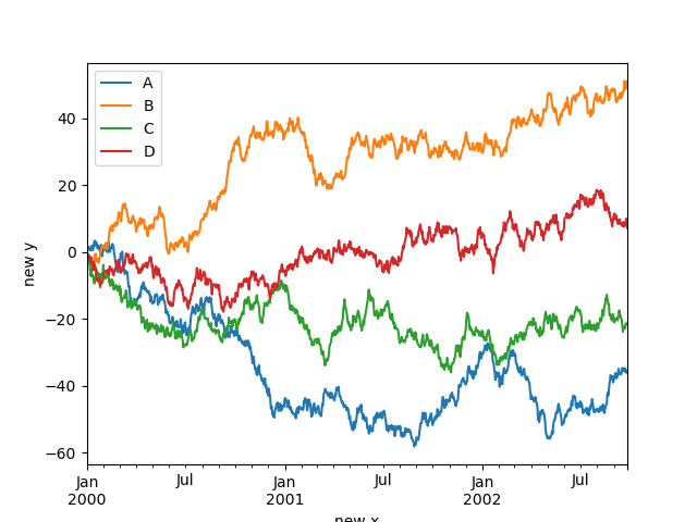
ラベルの制御#
xlabel および ylabel 引数を設定して、x 軸と y 軸にカスタムラベルを付けることができます。デフォルトでは、pandas はインデックス名を xlabel として取得し、ylabel は空のままにします。
In [127]: df.plot();

In [128]: df.plot(xlabel="new x", ylabel="new y");
スケール#
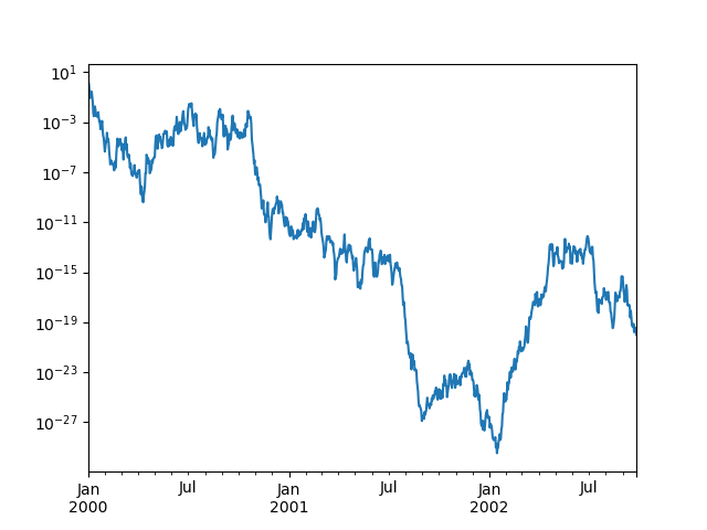
対数スケールの Y 軸を取得するために logy を渡すことができます。
In [129]: ts = pd.Series(np.random.randn(1000), index=pd.date_range("1/1/2000", periods=1000))

In [130]: ts = np.exp(ts.cumsum())

In [131]: ts.plot(logy=True);
logx および loglog キーワード引数も参照してください。
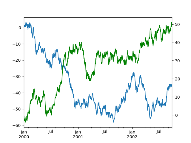
第2y軸へのプロット#
二次y軸にデータをプロットするには、secondary_y キーワードを使用します。
In [132]: df["A"].plot();

In [133]: df["B"].plot(secondary_y=True, style="g");
DataFrame の一部の列をプロットするには、secondary_y キーワードに列名を指定します。
In [134]: plt.figure();

In [135]: ax = df.plot(secondary_y=["A", "B"])

In [136]: ax.set_ylabel("CD scale");

In [137]: ax.right_ax.set_ylabel("AB scale");
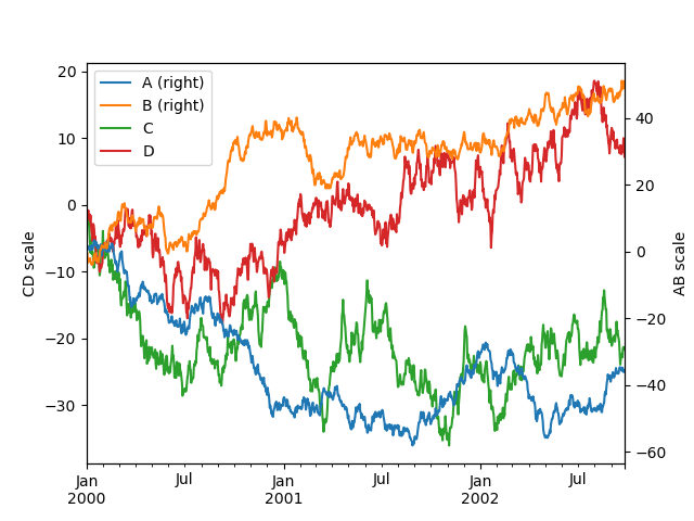
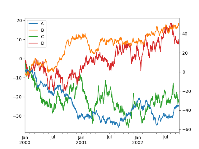
二次y軸にプロットされた列は、凡例に自動的に「(right)」とマークされることに注意してください。自動マーキングをオフにするには、mark_right=False キーワードを使用します。
In [138]: plt.figure();

In [139]: df.plot(secondary_y=["A", "B"], mark_right=False);
時系列プロット用のカスタムフォーマッタ#
pandas は、時系列プロット用のカスタムフォーマッタを提供しています。これらは、日付と時刻の軸ラベルの書式設定を変更します。デフォルトでは、カスタムフォーマッタは、pandas が DataFrame.plot() または Series.plot() で作成したプロットにのみ適用されます。それらを matplotlib で作成されたものを含むすべてのプロットに適用するには、オプション pd.options.plotting.matplotlib.register_converters = True を設定するか、pandas.plotting.register_matplotlib_converters() を使用します。
ティック分解能調整の抑制#
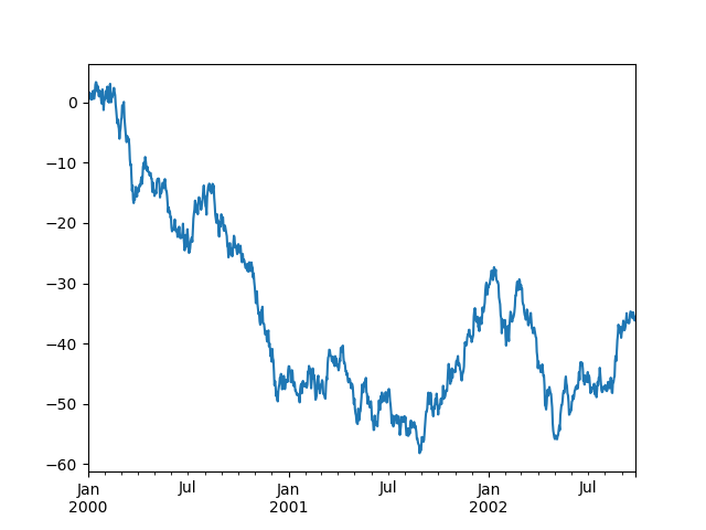
pandas には、通常の頻度の時系列データに対する自動ティック分解能調整が含まれています。pandas が頻度情報を推論できない限定的なケース(たとえば、外部で作成された twinx の場合など)では、アライメントのためにこの動作を抑制することを選択できます。
これがデフォルトの動作です。x 軸のティックラベルがどのように実行されるかに注意してください。
In [140]: plt.figure();

In [141]: df["A"].plot();
x_compat パラメータを使用すると、この動作を抑制できます。
In [142]: plt.figure();

In [143]: df["A"].plot(x_compat=True);
抑制する必要があるプロットが複数ある場合、pandas.plotting.plot_params の use メソッドを with ステートメントで使用できます。
In [144]: plt.figure();

In [145]: with pd.plotting.plot_params.use("x_compat", True):
   .....:     df["A"].plot(color="r")
   .....:     df["B"].plot(color="g")
   .....:     df["C"].plot(color="b")
   .....:
自動日付ティック調整#
TimedeltaIndex は現在、matplotlib のネイティブのティックロケータメソッドを使用しており、ティックラベルが重なる図に対しては、matplotlib の自動日付ティック調整を呼び出すことが役立ちます。
詳細については、autofmt_xdate メソッドとmatplotlib ドキュメントを参照してください。
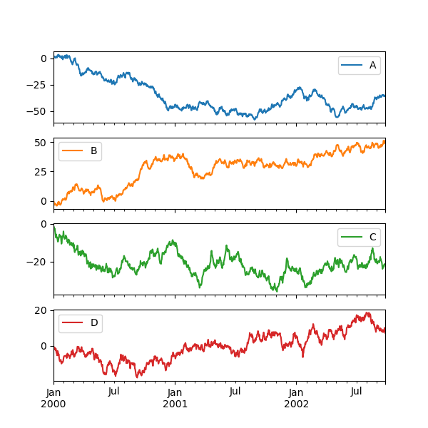
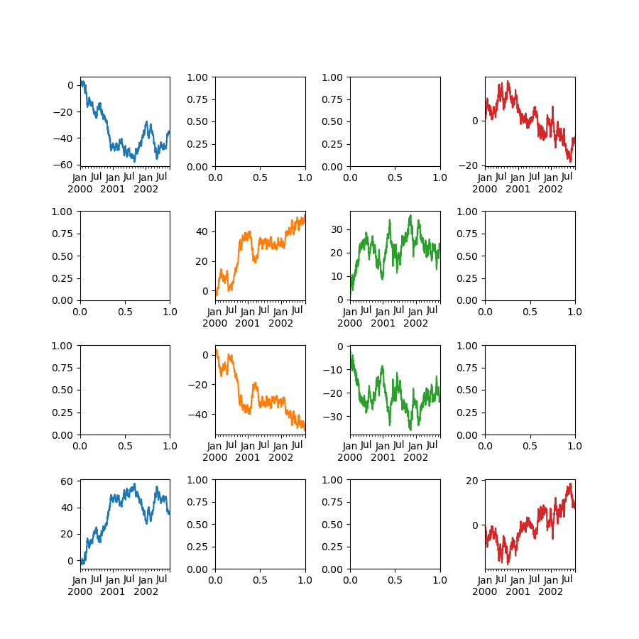
サブプロット#
DataFrame の各 Series は、subplots キーワードを使用して異なる軸にプロットできます。
In [146]: df.plot(subplots=True, figsize=(6, 6));
レイアウトの使用と複数軸のターゲット指定#
サブプロットのレイアウトは layout キーワードで指定できます。これは (rows, columns) を受け入れます。layout キーワードは hist と boxplot でも使用できます。入力が無効な場合、ValueError が発生します。
layout で指定された行 × 列で収容できる軸の数は、必要なサブプロットの数よりも大きくする必要があります。レイアウトが、必要な軸数よりも多くの軸を収容できる場合、空白の軸は描画されません。NumPy 配列の reshape メソッドと同様に、片方の次元に -1 を使用して、もう一方の次元が与えられた場合に、必要な行または列の数を自動的に計算できます。
In [147]: df.plot(subplots=True, layout=(2, 3), figsize=(6, 6), sharex=False);
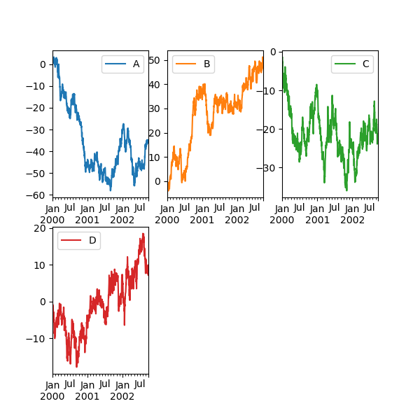
上記の例は、以下を使用するのと同等です。
In [148]: df.plot(subplots=True, layout=(2, -1), figsize=(6, 6), sharex=False);
必要な列数 (3) は、プロットする系列数と指定された行数 (2) から推測されます。
ax キーワードを介して事前に作成された複数の軸をリスト形式で渡すことができます。これにより、より複雑なレイアウトが可能になります。渡された軸は、描画されるサブプロットと同じ数である必要があります。
ax キーワードを介して複数の軸が渡される場合、layout、sharex、および sharey キーワードは出力に影響しません。sharex=False および sharey=False を明示的に渡す必要があります。そうしないと警告が表示されます。
In [149]: fig, axes = plt.subplots(4, 4, figsize=(9, 9))

In [150]: plt.subplots_adjust(wspace=0.5, hspace=0.5)

In [151]: target1 = [axes[0][0], axes[1][1], axes[2][2], axes[3][3]]

In [152]: target2 = [axes[3][0], axes[2][1], axes[1][2], axes[0][3]]

In [153]: df.plot(subplots=True, ax=target1, legend=False, sharex=False, sharey=False);

In [154]: (-df).plot(subplots=True, ax=target2, legend=False, sharex=False, sharey=False);
もう1つのオプションは、Series.plot() に ax 引数を渡して、特定の軸にプロットすることです。
In [155]: np.random.seed(123456)

In [156]: ts = pd.Series(np.random.randn(1000), index=pd.date_range("1/1/2000", periods=1000))

In [157]: ts = ts.cumsum()

In [158]: df = pd.DataFrame(np.random.randn(1000, 4), index=ts.index, columns=list("ABCD"))

In [159]: df = df.cumsum()
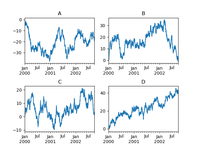
In [160]: fig, axes = plt.subplots(nrows=2, ncols=2)

In [161]: plt.subplots_adjust(wspace=0.2, hspace=0.5)

In [162]: df["A"].plot(ax=axes[0, 0]);

In [163]: axes[0, 0].set_title("A");

In [164]: df["B"].plot(ax=axes[0, 1]);

In [165]: axes[0, 1].set_title("B");

In [166]: df["C"].plot(ax=axes[1, 0]);

In [167]: axes[1, 0].set_title("C");

In [168]: df["D"].plot(ax=axes[1, 1]);

In [169]: axes[1, 1].set_title("D");
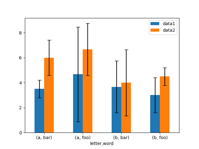
エラーバー付きプロット#
エラーバー付きのプロットは、DataFrame.plot() および Series.plot() でサポートされています。
水平および垂直のエラーバーは、plot() の xerr および yerr キーワード引数に指定できます。エラー値はさまざまな形式で指定できます。
プロットする
DataFrameのcolumns属性またはプロットするSeriesのname属性に一致する列名を持つDataFrameまたはdictのエラーとして。プロットする
DataFrameのどの列にエラー値が含まれているかを示すstrとして。生の値 (
list、tuple、またはnp.ndarray) として。プロットするDataFrame/Seriesと同じ長さである必要があります。
生データから標準偏差を持つグループ平均を簡単にプロットする方法の一例です。
# Generate the data
In [170]: ix3 = pd.MultiIndex.from_arrays(
   .....:     [
   .....:         ["a", "a", "a", "a", "a", "b", "b", "b", "b", "b"],
   .....:         ["foo", "foo", "foo", "bar", "bar", "foo", "foo", "bar", "bar", "bar"],
   .....:     ],
   .....:     names=["letter", "word"],
   .....: )
   .....:

In [171]: df3 = pd.DataFrame(
   .....:     {
   .....:         "data1": [9, 3, 2, 4, 3, 2, 4, 6, 3, 2],
   .....:         "data2": [9, 6, 5, 7, 5, 4, 5, 6, 5, 1],
   .....:     },
   .....:     index=ix3,
   .....: )
   .....:

# Group by index labels and take the means and standard deviations
# for each group
In [172]: gp3 = df3.groupby(level=("letter", "word"))

In [173]: means = gp3.mean()

In [174]: errors = gp3.std()

In [175]: means
Out[175]:
                data1     data2
letter word
a      bar   3.500000  6.000000
       foo   4.666667  6.666667
b      bar   3.666667  4.000000
       foo   3.000000  4.500000

In [176]: errors
Out[176]:
                data1     data2
letter word
a      bar   0.707107  1.414214
       foo   3.785939  2.081666
b      bar   2.081666  2.645751
       foo   1.414214  0.707107

# Plot
In [177]: fig, ax = plt.subplots()

In [178]: means.plot.bar(yerr=errors, ax=ax, capsize=4, rot=0);
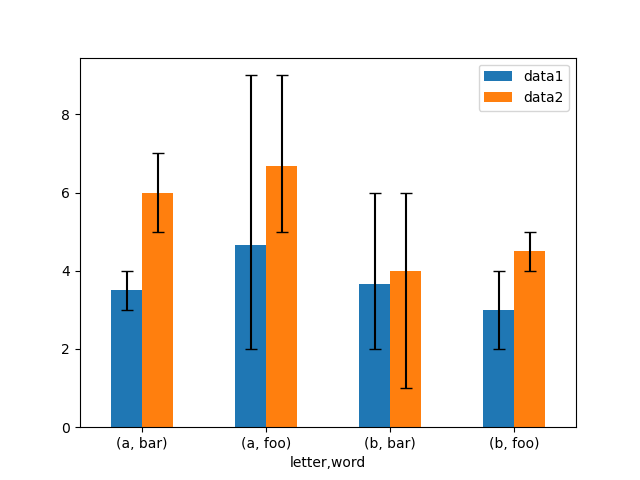
非対称のエラーバーもサポートされていますが、この場合は生の誤差値を指定する必要があります。N 長の Series の場合、下限と上限 (または左と右) の誤差を示す 2xN 配列を指定する必要があります。MxN の DataFrame の場合、非対称誤差は Mx2xN 配列で指定する必要があります。
以下は、非対称エラーバーを使用して最小/最大範囲をプロットする方法の例です。
In [179]: mins = gp3.min()

In [180]: maxs = gp3.max()

# errors should be positive, and defined in the order of lower, upper
In [181]: errors = [[means[c] - mins[c], maxs[c] - means[c]] for c in df3.columns]

# Plot
In [182]: fig, ax = plt.subplots()

In [183]: means.plot.bar(yerr=errors, ax=ax, capsize=4, rot=0);
テーブルのプロット#
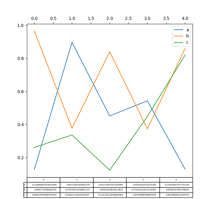
matplotlib テーブルを使用したプロットは、table キーワードを使用して DataFrame.plot() および Series.plot() でサポートされるようになりました。table キーワードは、bool、DataFrame、または Series を受け入れることができます。テーブルを描画する簡単な方法は、table=True を指定することです。データは matplotlib のデフォルトレイアウトに合わせて自動的に転置されます。
In [184]: np.random.seed(123456)

In [185]: fig, ax = plt.subplots(1, 1, figsize=(7, 6.5))

In [186]: df = pd.DataFrame(np.random.rand(5, 3), columns=["a", "b", "c"])

In [187]: ax.xaxis.tick_top()  # Display x-axis ticks on top.

In [188]: df.plot(table=True, ax=ax);
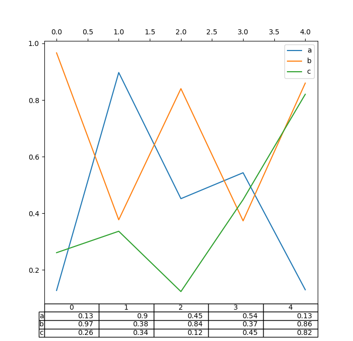
また、table キーワードに別の DataFrame または Series を渡すこともできます。データは、print メソッドで表示されるとおりに描画されます(自動的に転置されません)。必要に応じて、以下の例のように手動で転置する必要があります。
In [189]: fig, ax = plt.subplots(1, 1, figsize=(7, 6.75))

In [190]: ax.xaxis.tick_top()  # Display x-axis ticks on top.

In [191]: df.plot(table=np.round(df.T, 2), ax=ax);
また、DataFrame または Series からテーブルを作成し、それを matplotlib.Axes インスタンスに追加するヘルパー関数 pandas.plotting.table も存在します。この関数は、matplotlib table が持つキーワードを受け入れることができます。
In [192]: from pandas.plotting import table

In [193]: fig, ax = plt.subplots(1, 1)

In [194]: table(ax, np.round(df.describe(), 2), loc="upper right", colWidths=[0.2, 0.2, 0.2]);

In [195]: df.plot(ax=ax, ylim=(0, 2), legend=None);
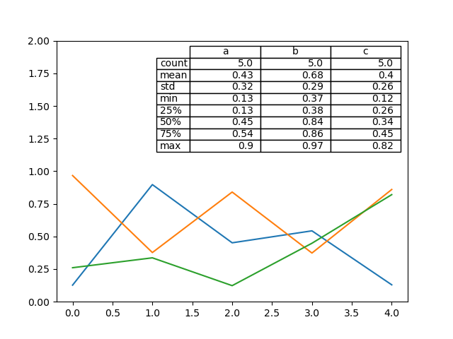
注: さらなる装飾のために、axes.tables プロパティを使用して軸上のテーブルインスタンスを取得できます。詳細については、matplotlib table ドキュメントを参照してください。
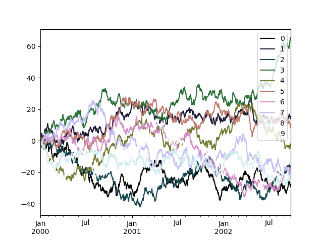
カラーマップ#
多数の列をプロットする際の潜在的な問題は、デフォルトの色の繰り返しにより、一部の系列を区別することが困難になることです。これを解決するために、DataFrame プロットでは colormap 引数の使用がサポートされています。この引数には、Matplotlib colormap または Matplotlib に登録されているカラーマップの名前を表す文字列のいずれかを受け入れます。デフォルトの matplotlib カラーマップの視覚化はこちらで利用できます。
matplotlib は線ベースのプロットにカラーマップを直接サポートしていないため、色は DataFrame の列数によって決定される等間隔に基づいて選択されます。背景色は考慮されないため、一部のカラーマップは簡単には見えない線を生み出します。
cubehelix カラーマップを使用するには、colormap='cubehelix' を渡します。
In [196]: np.random.seed(123456)

In [197]: df = pd.DataFrame(np.random.randn(1000, 10), index=ts.index)

In [198]: df = df.cumsum()

In [199]: plt.figure();

In [200]: df.plot(colormap="cubehelix");
あるいは、カラーマップ自体を渡すこともできます。
In [201]: from matplotlib import cm

In [202]: plt.figure();

In [203]: df.plot(colormap=cm.cubehelix);

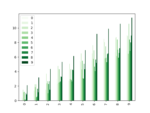
カラーマップは、棒グラフのような他のプロットタイプでも使用できます。
In [204]: np.random.seed(123456)

In [205]: dd = pd.DataFrame(np.random.randn(10, 10)).map(abs)

In [206]: dd = dd.cumsum()

In [207]: plt.figure();

In [208]: dd.plot.bar(colormap="Greens");
平行座標プロット
In [209]: plt.figure();

In [210]: parallel_coordinates(data, "Name", colormap="gist_rainbow");
アンドリューズ曲線グラフ
In [211]: plt.figure();

In [212]: andrews_curves(data, "Name", colormap="winter");
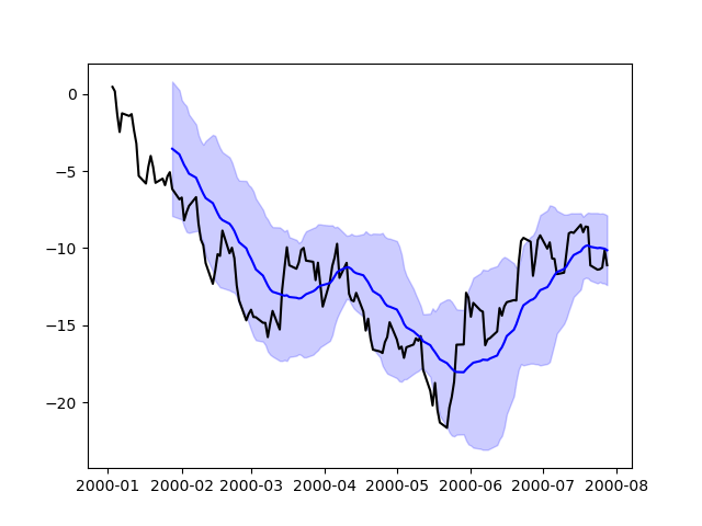
Matplotlib で直接プロットする#
特定の種類のプロットやカスタマイズが pandas でまだサポートされていない場合など、matplotlib で直接プロットを準備することが好ましい、または必要となる状況もあります。Series および DataFrame オブジェクトは配列のように動作するため、明示的なキャストなしで matplotlib 関数に直接渡すことができます。
pandas は、日付インデックスを認識するフォーマッタとロケータも自動的に登録し、これにより、matplotlib で利用可能なほぼすべてのプロットタイプに日付と時刻のサポートを拡張します。この書式設定は、pandas を介してプロットする場合と同じ洗練されたレベルを提供しませんが、多数の点をプロットする場合により高速である可能性があります。
In [213]: np.random.seed(123456)

In [214]: price = pd.Series(
   .....:     np.random.randn(150).cumsum(),
   .....:     index=pd.date_range("2000-1-1", periods=150, freq="B"),
   .....: )
   .....:

In [215]: ma = price.rolling(20).mean()

In [216]: mstd = price.rolling(20).std()

In [217]: plt.figure();

In [218]: plt.plot(price.index, price, "k");

In [219]: plt.plot(ma.index, ma, "b");

In [220]: plt.fill_between(mstd.index, ma - 2 * mstd, ma + 2 * mstd, color="b", alpha=0.2);
プロットバックエンド#
pandas はサードパーティのプロットバックエンドで拡張できます。主なアイデアは、ユーザーが Matplotlib に基づいて提供されているものとは異なるプロットバックエンドを選択できるようにすることです。
これは、plot 関数の引数 backend として「backend.module」を渡すことで行うことができます。例:
>>> Series([1, 2, 3]).plot(backend="backend.module")
あるいは、このオプションをグローバルに設定することもできるため、各 plot 呼び出しでキーワードを指定する必要はありません。たとえば、
>>> pd.set_option("plotting.backend", "backend.module")
>>> pd.Series([1, 2, 3]).plot()
または
>>> pd.options.plotting.backend = "backend.module"
>>> pd.Series([1, 2, 3]).plot()
これは多かれ少なかれこれに相当するでしょう。
>>> import backend.module
>>> backend.module.plot(pd.Series([1, 2, 3]))
バックエンドモジュールは、他の視覚化ツール(Bokeh、Altair、hvplotなど)を使用してプロットを生成できます。pandas のバックエンドを実装しているいくつかのライブラリは、エコシステムページにリストされています。
開発者ガイドは https://pandas.dokyumento.jp/docs/dev/development/extending.html#plotting-backends で見つけることができます。